Expedia Group
Reimagining analytics - from internal
jargon to partner language
Analytics for partners
Hotels that list with Expedia Group have access to the Analytics product, which provides plenty of numbers around how they were performing on our sites.
However, the experience had accumulated years of internal jargon, fragmented navigation, data without context, and tech debt.
Partners struggled to find what they needed, were suspicious of what they did see, and spent hours manually cross-checking Expedia's data with their own sources.
What 18 partner interviews revealed
We discovered that level of engagement with Expedia and ambition influenced partner's relationship with analytics and were more consequential than market segment. This reframed how we thought about content and information architecture entirely.
In other words, we needed to tell a story.
The previous Analytics experience
How did partners actually use analytics?
We mapped the most prominent use cases of our partners. These were the three categories we used to define how we were going to group each piece of data, design it, and then communicate it.
The existing navigation had over a dozen labels that used Expedia's internal terminology, which led to a confusing and unpredictable experience for partners.
I redesigned the information architecture to match how partners actually think about their business. This would serve as the map for our new flow.
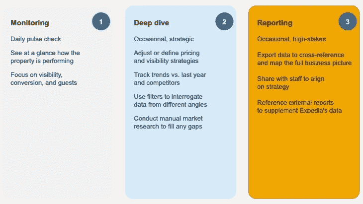
We discovered that partners had three primary uses of the data: monitoring, deep diving, and reporting.
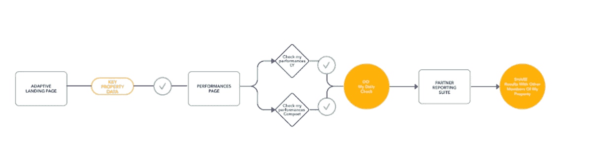
We simplified the partner's mental model to a basic flow.
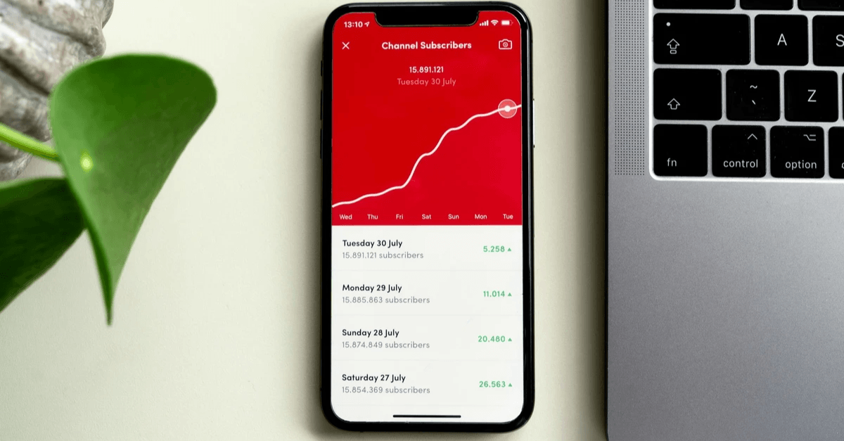
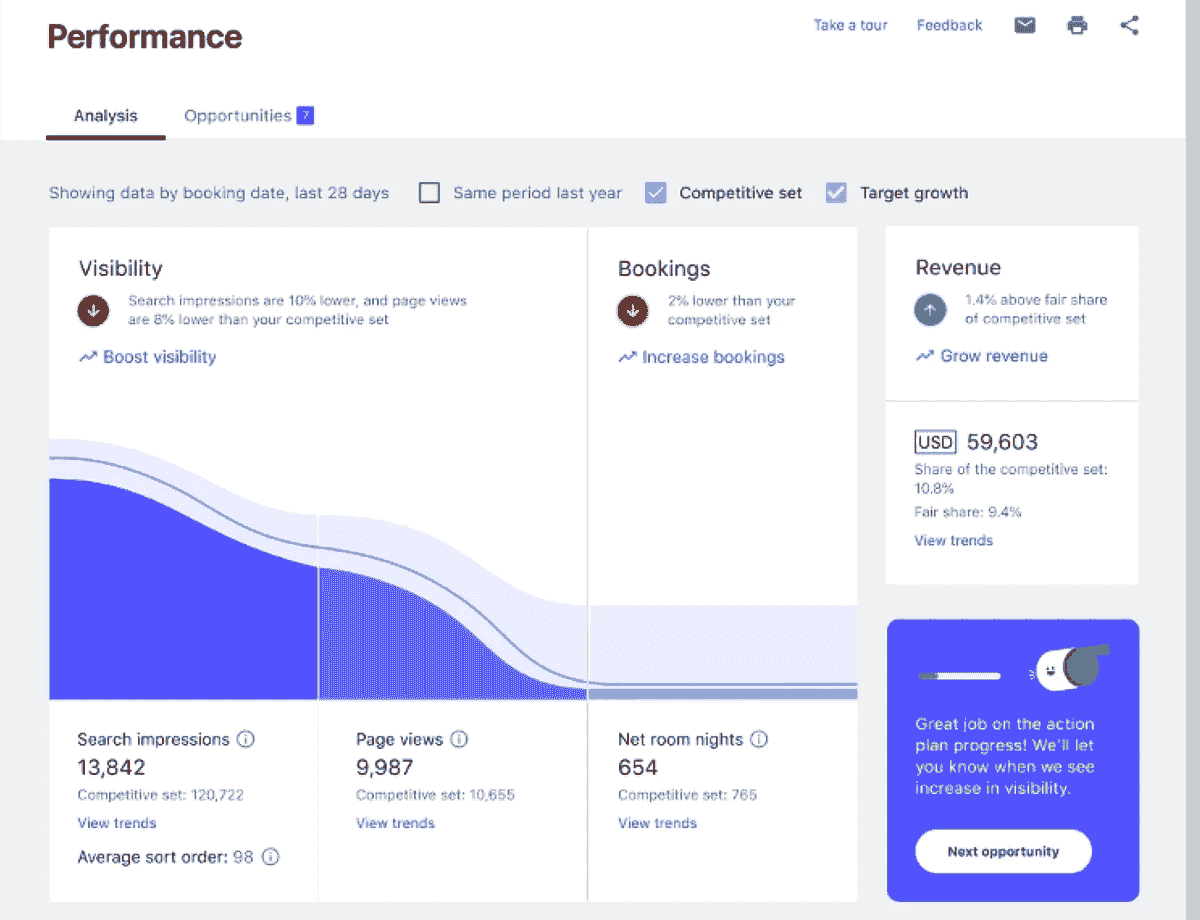
Monitoring performance
Partners said that they wanted an easy, intuitive way to understand how they were performing. So we designed a simple conversion graph with simplified language so they could quickly check the pulse of their overall performance.
This is the first page they saw when navigating to the Analytics page.
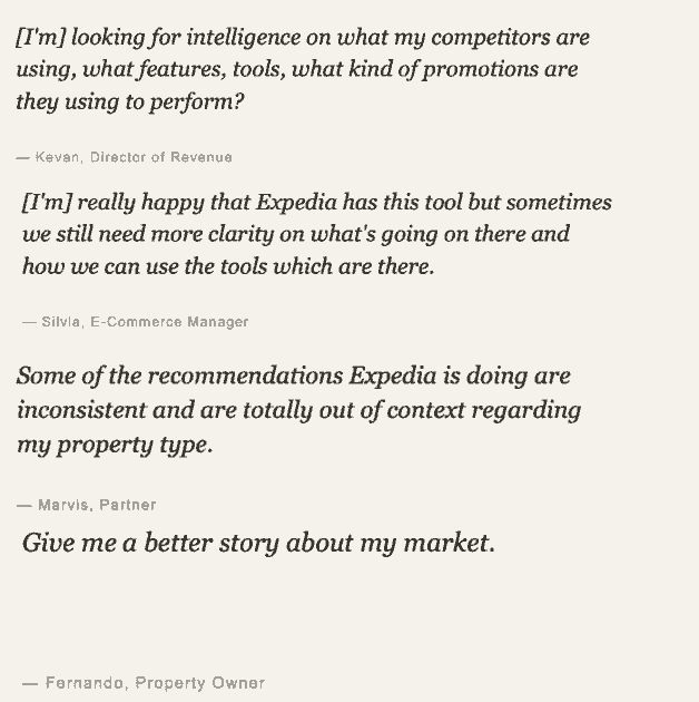
What our partners had to say


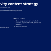
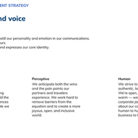
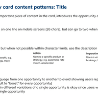
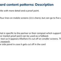
Not only did we redesign the Analytics space, I also created the entire content strategy that other design teams could use for incorporating data content in their own product areas.
This is a snippet of the strategy that I shared with the other teams.